Cannon Hill, London
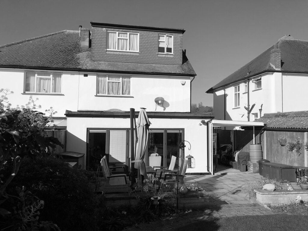
Our clients had lived in their semi-detached house in Wimbledon SW20 for 29 years. They had worked on the house over the years but wanted more space and were looking to move. The couple eventually decided to improve their existing home, adding a further ground floor extension, re-jigging the layout and refurbishing to enable them to stay in the property. Their big motivation was to improve the existing kitchen.
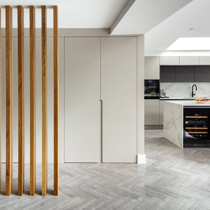
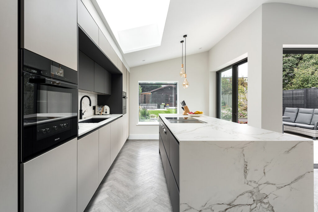
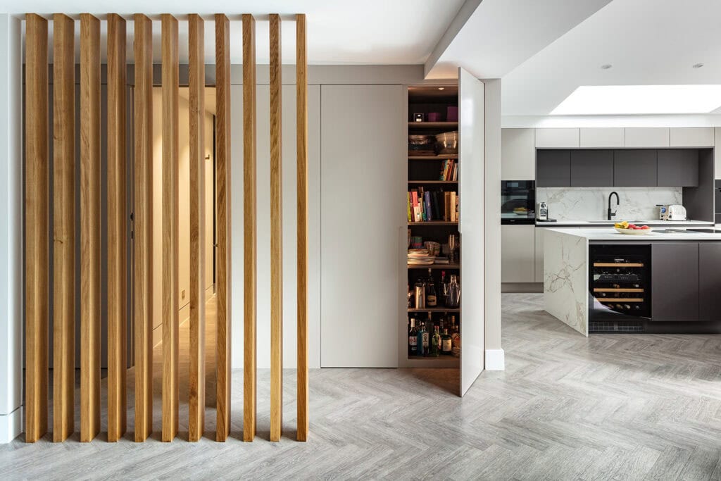
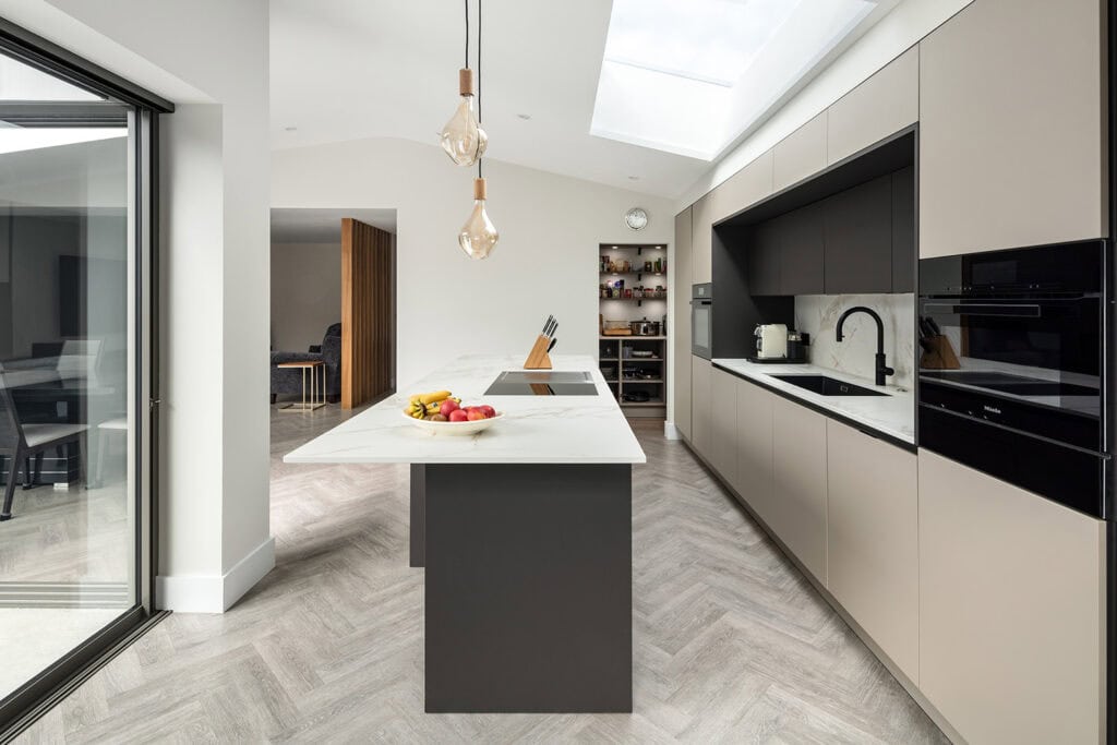
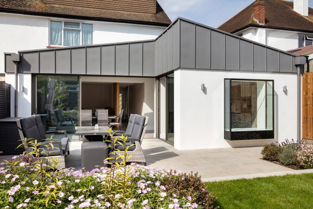
We designed a new wrap-around side and rear extension with a stepped plan to project the kitchen into the garden.By moving the kitchen to the side and rear of a new extension, we created a light-filled kitchen area with a greater connection to their attractive garden while still providing good space for a sitting room at the back of the extension and dining space by the glazed doors.The space gained from the extension provided room for an additional utility and WC, along with a separate walk-in pantry directly off the kitchen. The kitchen, pantry and utility were all fitted out by Kitchen Revolutions, who worked closely with the clients and us to achieve the look we were all trying to achieve.
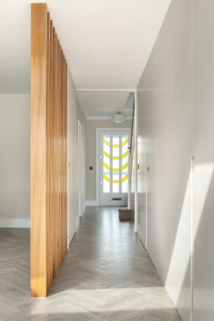
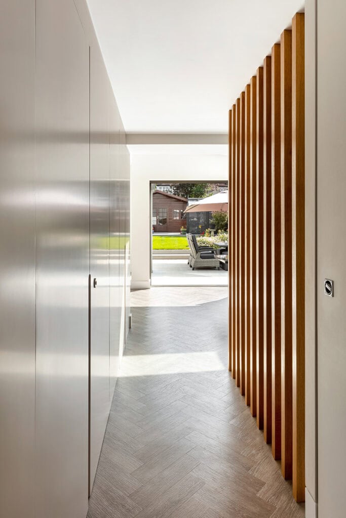
To rationalise the layout, we removed a kink in the hallway, which realigns the front and rear of the house. The internal spaces open to the underside of mono-pitched roofs for extra drama and a feeling of space.
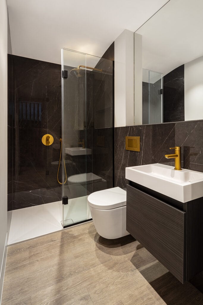
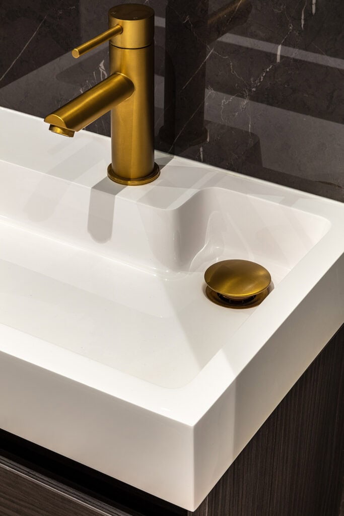
From a materials palette perspective, we showed the clients a beautiful dark black imitation marble porcelain tile for the shower room, which they loved and wanted to use. They wanted a light and airy feel for the rest of the space, so this set a precedent for the rest of the design.Using warm, light grey tones and off-whites, offset by a small amount of dark contrasting features such as the glazing frames, anthracite finish on the kitchen island and wall units, shower room and external zinc cladding, we created a quiet dynamic in the spaces. The zinc also brings down the overall massing of the extension, breaking up the facade.
This was softened by introducing a light but warm-toned timber effect floor and oak finial screen dividers to break up the corridor through from the hall into the sitting area. A pivot fire door was also integrated into the design, which pockets away to create a seamless corridor between the entrance hall and open-plan kitchen space when not in use.
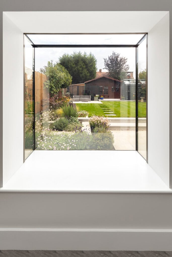
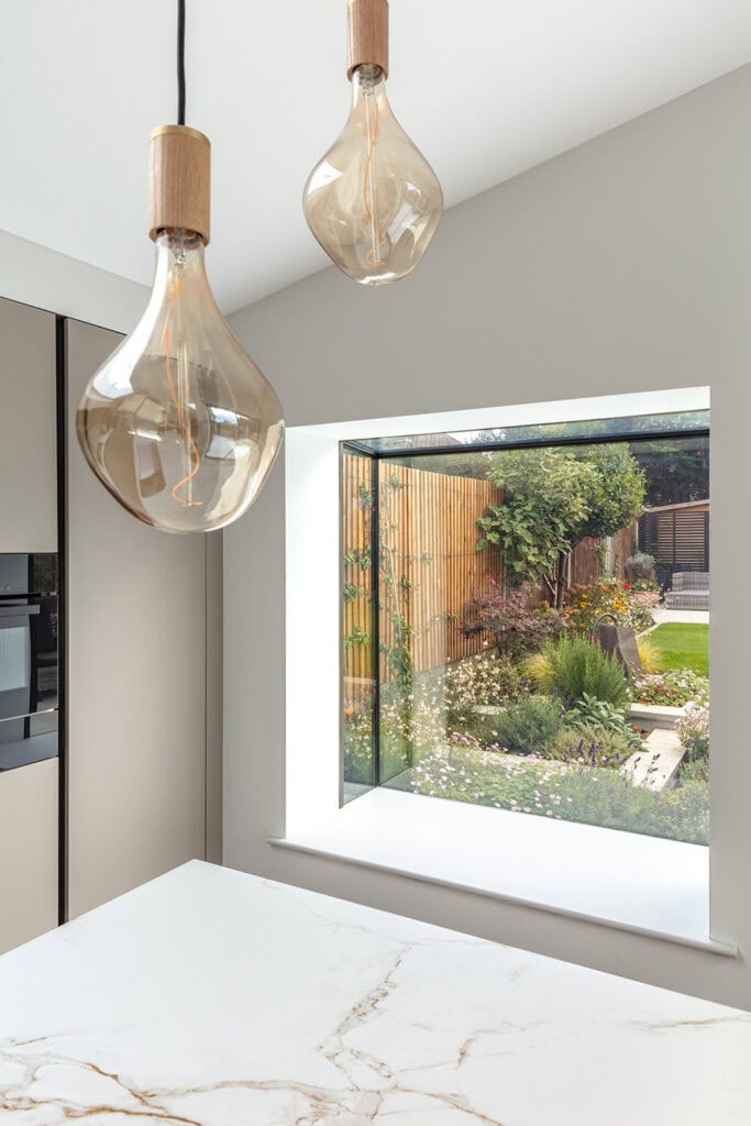
We have used a mixture of glazing features; minimal framed sliding doors, large roof lights and an oriel bay window that frames the garden from the kitchen. These provide lots of natural light into the home and create a great connection with the outside. We transformed the garden with more planting and the addition of an outdoor dining area.
Shower room fittings:
Tiles – Porcelain Tiles
Brassware – Lusso Stone
Basin/vanity – Drench
Pendant Lights over kitchen Island – Tala
| Client | Private |
| Contractor | Pace Projects |
| Structural Engineer | Mitchinson Macken |
| Key Suppliers | Maxlight Glazing |
| Photography | Andrew Beasley |

